Progress indicators on the mobile web: a qualitative survey

Have you ever had an argument about a progress indicator in a signup form?
These elements, also known as progress steppers, signpost the way to TRILLIONS of dollars worth of customer purchase interactions every year.
Recently, I noticed a debate raging on LinkedIn about which progress UI pattern was more effective, with 4,000+ reactions and 200+ comments. The stimulus for this argument was a post on UI Movement (Medium member-only) about "good" and "bad" progress indication patterns.
It's one thing to read opinions from designers about this pattern, but I'm more curious about what a regular web audience thinks about this kind of UI element and the functionality it provides.
To that end, I put a qualitative user test together and sent it out to 100 participants.
The test was a simple one. I put together a couple of wireframes of the different UI patterns, and asked participants which design was most useful to them in the context of a complex online interaction – like signing up for an electricity account.
Here are the challengers:


Preference test results
Which one of those options do you think came out on top?
Personally, my money was on C, the radial progress stepper concept, considering how clear and simple it seems to my eye, and how visual the process seems.
Ready to find out? Brace yourselves for a graph!

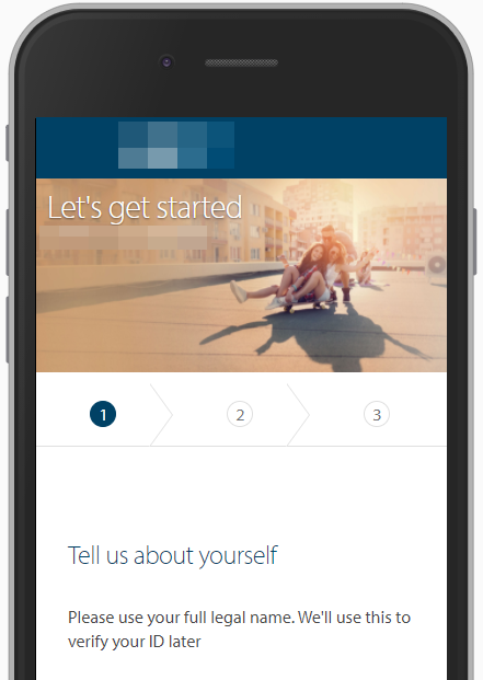
The overwhelming preference was option B, the linear progress stepper! That's this one:

I love being shocked by research, don't you?
That's right, the linear progress stepper is out in front by a country mile, leaving the radial indicator, simple number and slimline text variants in the dust.
But you can't trust what people tell you, right?
True, but there's no feasible way to test this in the lab without asking people what their preference is.
The data that this line of questioning generates is 'attitudinal', i.e. measuring what people say they are thinking. By its very nature, it can lead to fuzzy results.
That said, it's still useful data to gather from your audience because they're giving you an insight into their conscious thought processes.
The alternative lab study would be cumbersome. We could prototype the different variations together with live inputs in Axure, test the whole form end-to-end with people, then reflect on how they felt about each stage of the process.
Depending on your organisation's level of design maturity, this could take anywhere from 2 weeks to 2 months to get prototyped, organised, tested and analysed.
Ain't nobody got time for that! We spent less than 8 hours and US $200 on this test, from initial prototypes to final data analysis.
More tangible performance metrics like form completion time or per-step drop-off give you a different dataset to look at, but they won't tell you why your designs are (or aren't) hitting the mark.
You have to guess at that yourself, unless you have this attitudinal data.
Why was this the winner?
I followed up the preference test with a 'why did you choose this option' question, collated all of the 'why did you choose this one' text input data, did some categorisation tagging to each response, and pretty quickly a pattern emerged.
People liked it because it was context-heavy.

'Details each section' responses were focused on how well this UI pattern shows the entirety of a form's contents.
'Shows progression' responses were heavy on the idea that your position in the form was shown in detail.
'Focus on ease' was allocated to any response that mentioned that this pattern was 'easy', 'simple', 'clear', etc.
'Gives me feel of time required' is pretty self-explanatory - different to 'progression' in that participants in this categorisation actually mentioned 'time', 'how long it will take', or similar.
There's a long tail of categories here, but looking at these top categories gives you most of the data that you need to make this decision, or to modify your designs appropriately.
More context in this element gave users a much better signal about what to expect when filling out this form from start to finish.
What did we learn?
It's easy to say 'make sure you do lots of user testing because the results may shock you!', and look, I'm not going to contradict that, given the results.
Radial steppers are all the rage in the design community because they look elegant. There's also a lot less text on a radial progress indicator, which is a common piece of feedback from stakeholders in most areas of business.
But not a single user responded positively to an alternative concept with the reason that 'it had less text'.
Implementing a radial stepper or 'next step only' slimline element is simpler than building a linear progress stepper, which also weighs heavily in any decision-making process about this kind of element.
If you've got a form that is of variable length, e.g. if a customer is upsold more products during checkout, or there's logic that forks the happy path depending on selecting options, then building a linear progress indicator is a curly challenge.
What happens when a user will only see 2 steps? Or 6? It's much easier from a development perspective to show only what the next step is.
But if you're designing for user satisfaction, then a linear progress stepper is a must-have, even on mobile.
Join us for more free research!
If you enjoyed this article, I do one of these free user research project writeups every month. Sign up now to join the community!

